
Credits
Design Director: Sabine Dowek
Designer: Mingu Lee
Client: Redscout
Studio: Redscout
Elevating Redscout's brand through modern typography
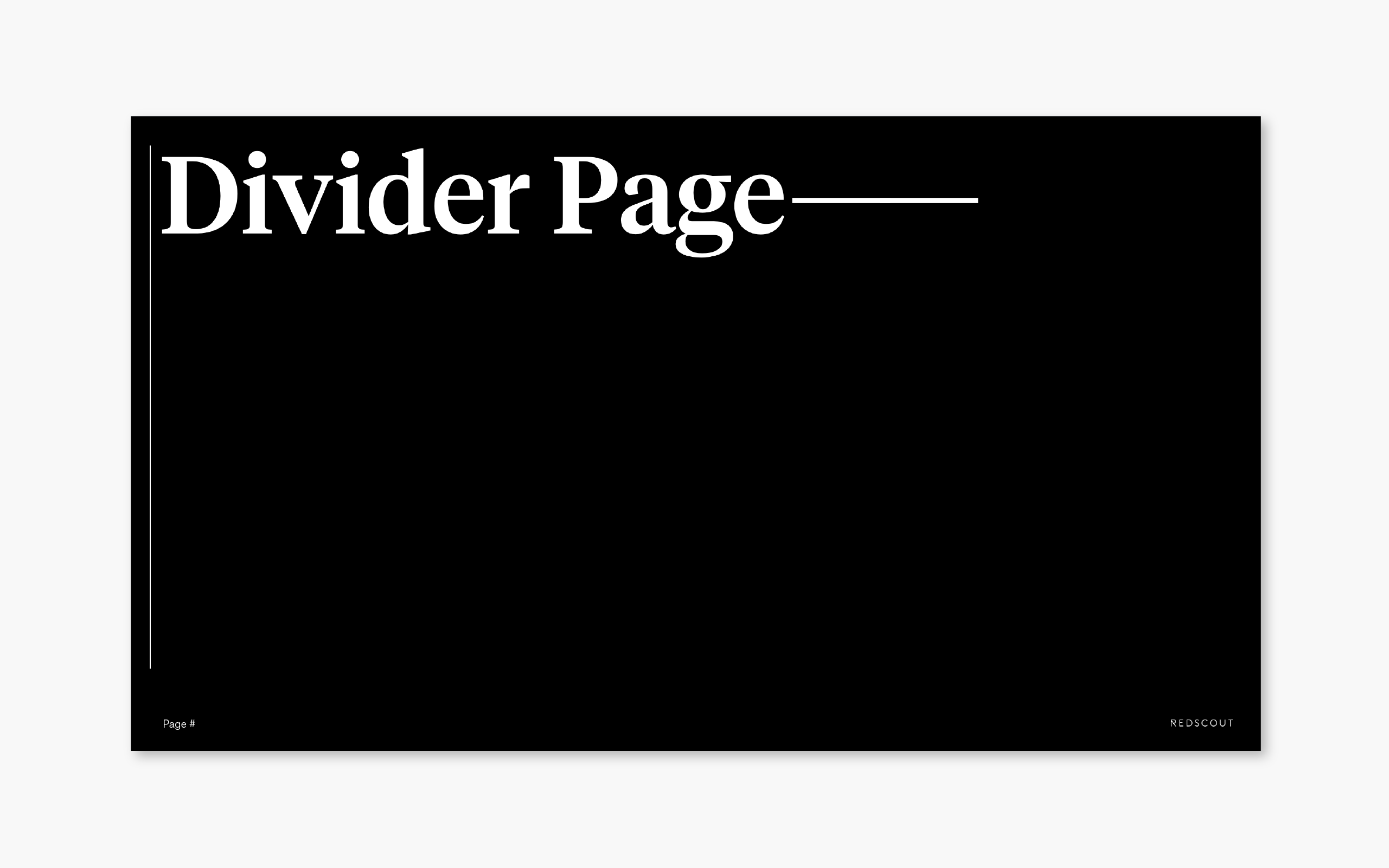
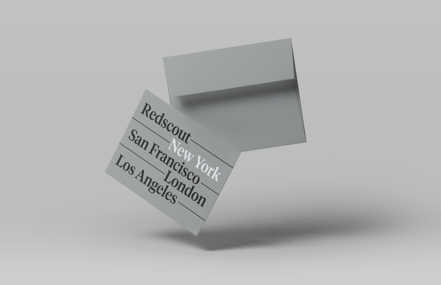
Since its rebranding back in 2014, Redscout has grown a lot. Team got bigger. Clientele is stronger. It was time for Redscout to reconsider its positioning and brand identity as a grown-up. What we first did was to say goodbye to the typeface ‘Brown’ and redefine our brand typography for more elevated look and feel. In need of a new stationery, we decided to design a thank you card with a new typeface, Tiempos, as it is elegant and versatile, and brings editorial quality when combined with sleek line treatment. We went purely typographic with the design and decided to highlight each city where our office is located to communicate where the messaging is coming from for both writer and recipient.


